SCHEDULE A CALL
Dots-top

Kettering Health – a system-wide rebranding story

After 20 years of growth and expansion, Kettering Health Network needed a cohesive brand identity that incorporated all parts of the health system.

Dots-grey-stair
White-Stair

The Challenge

​Kettering Health Network began in 1999 as four hospitals in the Dayton, Ohio area. Over the next 20 years, the system expanded through new construction and acquisition to include 13 medical centers, Kettering College, Kettering Physician Network and more than 120 outpatient facilities stretching from Dayton to Cincinnati.

As plans were finalized for a new hospital, the leadership team realized that Kettering Health Network had no cohesive brand look or message. So, they committed to a system-wide rebranding initiative that would clearly show the community where to find the compassionate, faith-based care synonymous with the Kettering name. They also chose the Ten Adams team to lead them through the process of rebranding an entire network. We were more than ready to accept the challenge!

Jimmy Phillips, VP of Marketing & Communications, Kettering Health, shares his perspective on what it was like to partner with the Ten Adams team, tackle challenges in the midst of COVID and launch a successful rebrand.

The Situation

Goals for the system-wide rebranding initiative focused on differentiating the patient experience, supporting growth for new patient acquisition, increasing physician referrals and gaining market share. With six other health networks in the service area and a highly competitive market, breaking through the noise to reach the community and healthcare decision makers would be no small task.

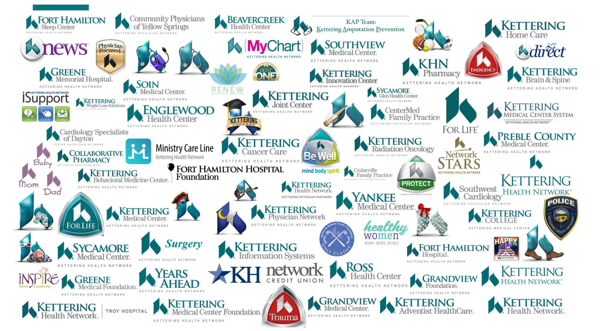
For an example of where we started, check out the image below. This logo audit provides a glimpse into the multiple names, styles and designs used throughout Kettering Health Network before the rebrand. The visual really illustrates the inconsistent nature of naming and identifying hospital facilities and services. It showed us that a critical piece of the rebranding puzzle would involve a defined naming system that allowed for growth, both geographically and in service line offerings.


Old-Kett-Logos_2896x1600-2048x1131


The Insight

Before transformation of any kind could begin, we had to know what we were working with. Enter: consumer research.

Brand awareness and perception studies within the western Ohio market showed “Kettering” as the most well-known and trusted healthcare ​brand in the Dayton area. 

Unfortunately, the better reputation wasn’t translating into more business. While consumers said Kettering Health Network had a better reputation, they accessed healthcare services from competitors. Clearly, perception and reality weren’t lining up which meant critical pieces of market share were in jeopardy.

Armed with consumer opinions about the value of the “Kettering” name, facility names, religious affiliation and the “K” icon, Ten Adams led the team through:

  • On-Site Discovery Sessions​
  • Local Clinic + Affiliate Review​
  • Brand Workshops​
  • Competitor Audit
  • Market Assessment

When the dust finally settled on the spreadsheets and presentations, the message was clear. The strength of the Kettering Health Network brand fizzled once you moved past the hospital into outlying clinics and facilities.


The Solution

Ten Adams uses a proprietary 5-D process to help clients identify the core of their brand and use that knowledge to bring it to life. Kettering Health Network embarked on one of these strategically focused journeys and set an end goal of becoming the most well-known and beloved healthcare brand in their region.

What would it take to bring this vision to fruition?

  • Brand Development​
  • Brand Image Campaign: Consumer + Internal​
  • Website Redesign ​
  • Logo Design + Brand Standards​
  • Nomenclature, Architecture + Naming Conventions
  • Signage

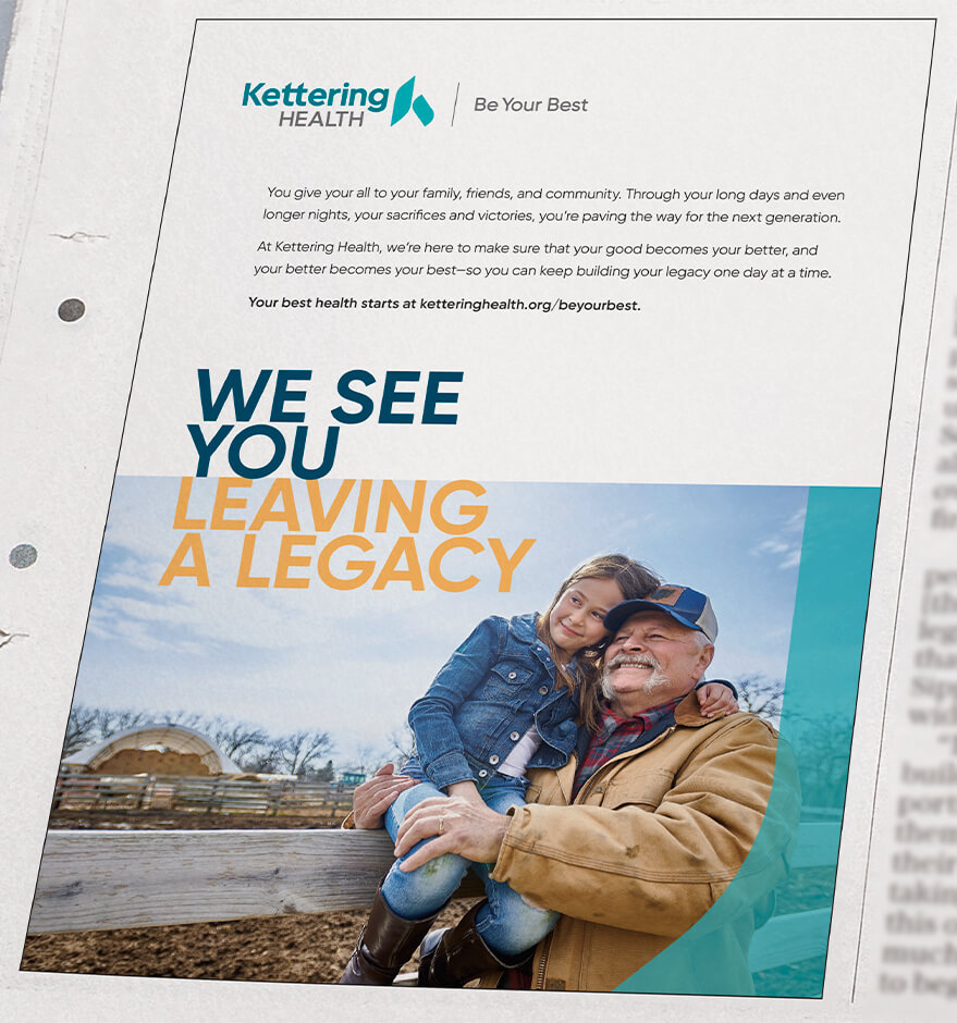
After completing foundational work related to brand personality and strategic direction, the Kettering Health Network team turned to their religious roots for inspiration. Words from renowned theologian St. Jerome guided the creative messaging for the rebranding initiative. It also sparked an idea about how a highlight reel could show “Kettering” bringing out the best in people, as it relates to health and wellness of course.

Kett-BYB-Logo_1000x640


“Good. Better. Best.​ Never let it rest.​
‘Til your good is better, ​and your better is best.”​

St. Jerome

After abbreviating Kettering Health Network to Kettering Health, choosing the theme and tag line, it was time to get creative! The team divided the brand image campaign into internal projects and consumer-focused initiatives to make sure all audiences received the most appropriate message.

Once we presented concepts, received feedback, and had a solid product to move forward with, we had to test the ads and see what the public liked. We utilized these results to guide our messaging, tweak our imagery and refine creative direction and music.

Website

While our creative team worked on the campaign, our digital team took the lead on building a new website. You can read the details of that project here, but in a nutshell, we built a better, stronger website from the ground up.

“While our names are changing, we are still the same organization at our core. We remain steadfast in our commitment to combining Christ-centered care with exceptional medicine to bring health, healing and hope to every person we serve.”

Fred Manchur
CEO of Kettering Health

Kett-Brand_2896x1600-2048x1131

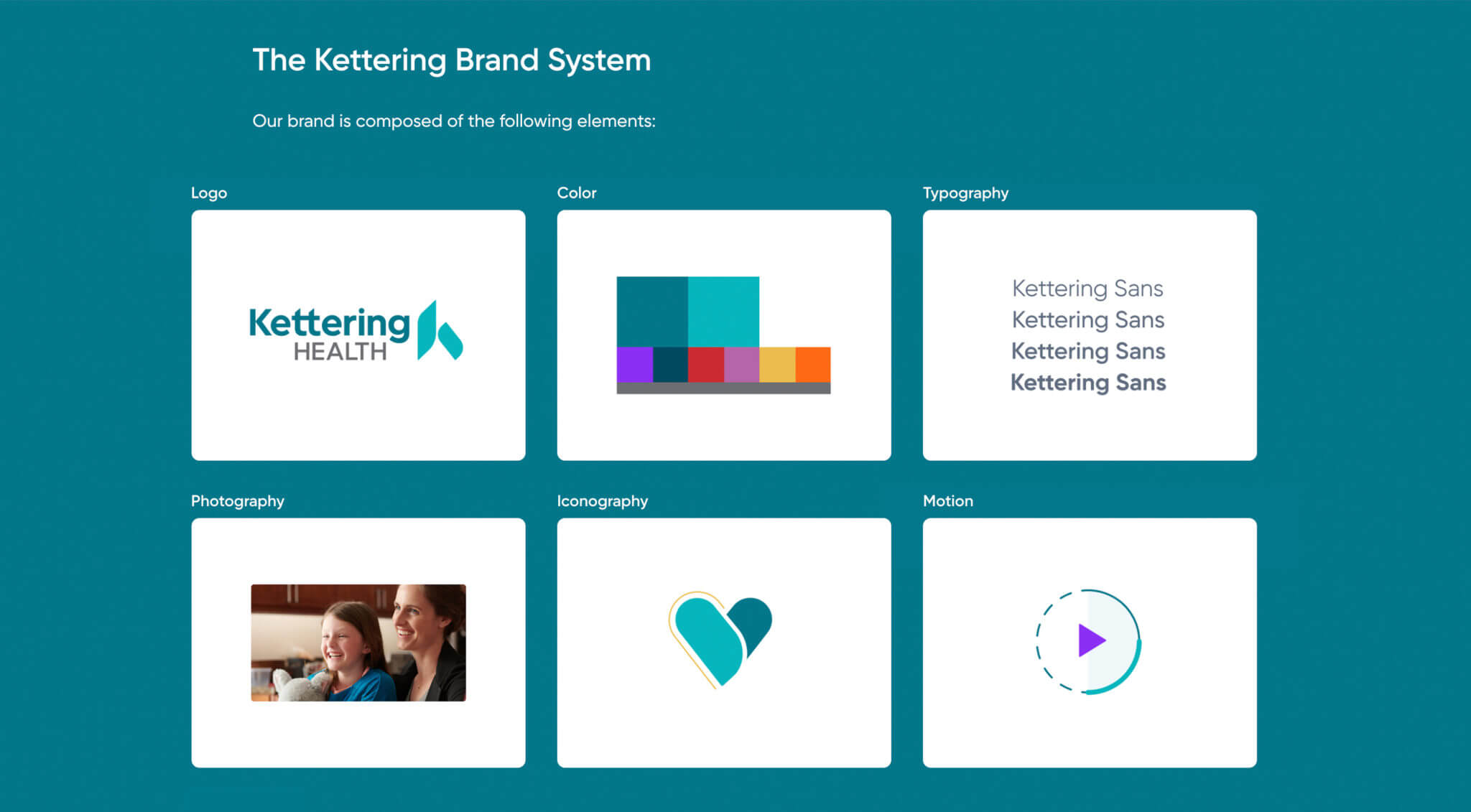
A fresh logo, updated colors and iconography and a custom font called Kettering Sans served as building blocks for the new brand standards.

  • 8 Brand TV Spots with Custom Music
  • 25 Outdoor Boards
  • 30 Digital Display Ads
  • 39 Print Ads

The creative elements listed above introduced Kettering Health to the community and clearly showed how our team of medical professionals helps bring out the best in every person.


Brand TV Spots with Custom Music​


Outdoor Boards

Kett_Outdoor_BirthdayBalloons_2896x1600-2048x1131

Kett_Outdoor_DogMom_2896x1600-2048x1131

Print Ads

Kett_Print_HomeReno_879x940

Kett_Print_LegacyFarmer_879x940

Kettering Health on GIPHY

The Ten Adams team used GIPHY as a new tactic for brand awareness. We produced six GIFs for the Be Your Best campaign. In the first month of the campaign launch, the GIFs and stickers reached 1.8M Total Impressions.

Wanna know the most popular GIF? It was the carrot on a fork! “Be Your Best – Eat Healthy” had over 1 million Total Impressions. It also had fun tags like Yum, Noms, and Yummm.

be_your_best_needle


eat_healthy_animated


The Results

Kettering Health unifies all parts of their system into a cohesive brand identity.

3.8%

Increase in top-of-mind awareness

4.3%

Increase in consumer preference

300K

Increase in website traffic

Ready for results? Let’s build something amazing together.

With almost 40 years of experience and 100% focus on healthcare, we’re ready to tackle your biggest challenges with confidence. Together, let’s reimagine what’s possible and drive impact that’s transformative. 

SCHEDULE A CALL