


The Challenge
Kettering Health committed to a system-wide rebranding initiative focused on differentiating the patient experience, supporting growth efforts for new patient acquisition and key patient care services, increasing physician referrals, and gaining market share in western Ohio.
A critical component of this brand effort involved addressing several outdated website properties. With a proven track record of successful rebranding, optimizing user experience, and transforming vague medical language into content that connects, Ten Adams was a natural partner for this project.
The Situation
Kettering Health understood the magnitude of a complete digital transformation. To be successful, this ambitious endeavor needed to increase brand awareness, build stronger relationships with multiple audiences, elevate organizational reputation, and certainly drive growth. Internally, the team wanted to remove old systems and processes, consolidate unnecessary assets and websites, and fundamentally redefine the role of the Kettering website. Externally, they needed to listen to the voice of the consumer and put their needs above all.
The Insights
With six other health networks in the service area, market share competition was intense. To gain a full understanding of what we were up against, we assessed the competitive landscape, audited the current website, analyzed performance data, conducted internal stakeholder interviews plus an external user survey with more than 4,000 participants, researched best practices beyond healthcare, and collaborated on several strategy sessions to define 7 key project priorities.
The Solution
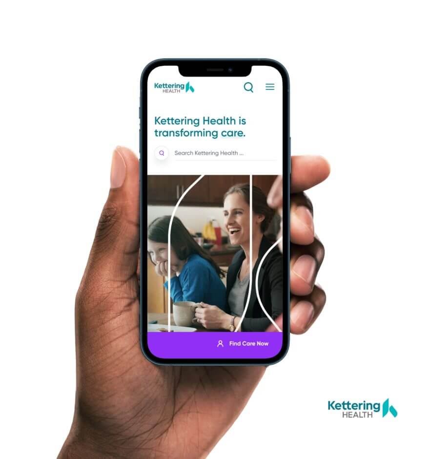
Our digital team took the lead on building a new ketteringhealth.org that delivered on the commitment of “One Best Practice” for the system. We developed a comprehensive content strategy, reorganized the entire Information Architecture, rebuilt the data architecture, simplified the site navigation and global search, designed each interaction to be mobile first, streamlined the transaction to choose care, elevated the brand voice and tone, and built a foundation for future expansion. Basically, we built a better, stronger website from the ground up.
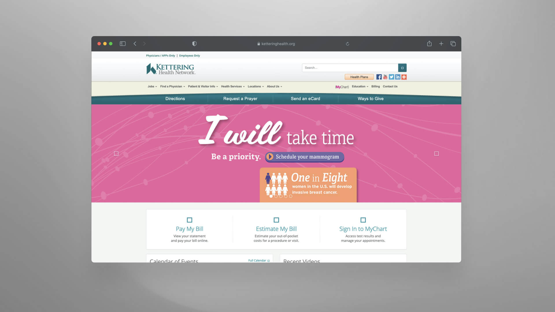
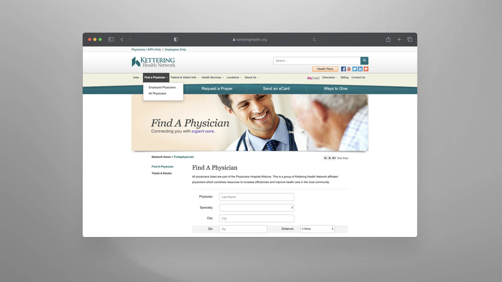
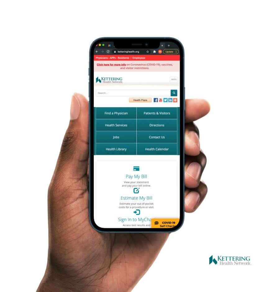
The old website lacked a Content Management System and Design System needed to scale.
User Feedback
With almost 90% of survey participants reporting quality interactions with Kettering (including 80% who live within 25 miles of the health system) their candid feedback offered invaluable data points. Their descriptions of the current website also stung a little…
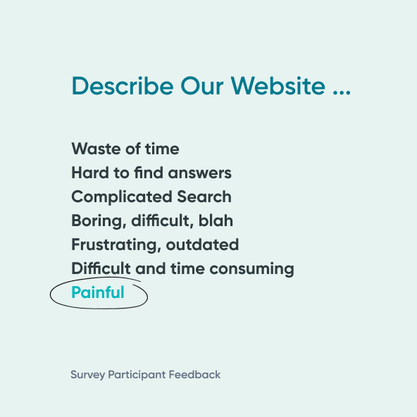

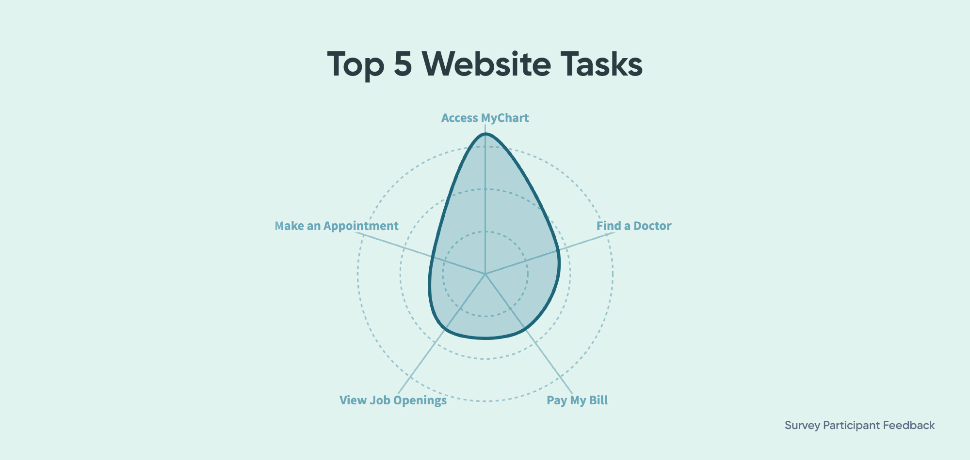
We needed to overhaul the website to provide a consistent brand experience and shift audience perception of the site from “annoying and frustrating” and a “waste of time” to a helpful, consumer-focused resource. The majority, 61% of participants, identified the following 5 tasks as most important to them when using a hospital website:
Content Strategy
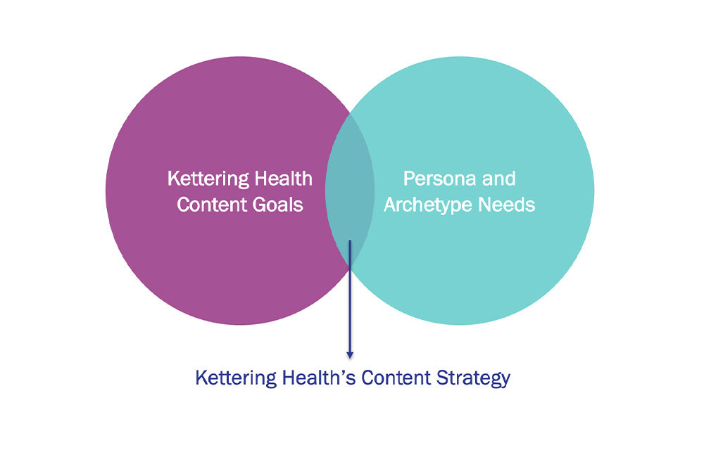
Once the community confirmed our assumption that the current website needed a complete overhaul, it was time to discuss content. Our brilliant friends at Aha Media Group guided the Kettering team to craft a content strategy where they addressed five key questions:
- To whom are we speaking?
- Who are we?
- What are we trying to say?
- How do we say it?
- When and where do we say it?
The answers to these questions generated useful, effective content and a solid plan for when and how to share information.
"Ten Adams brought a thoughtful and clear plan for creating a website, content and digital strategy that would help the organization grow and evolve, as well as care for the community through Kettering Health’s unique mission. We enjoyed working with them on content strategy, content creation, workflow and governance, as well as writing training."
Ahava Leibtag
President, AHA Media Group
Information Architecture
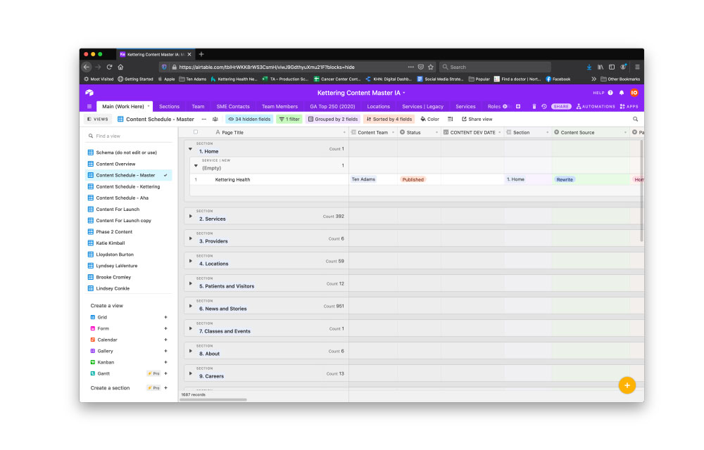
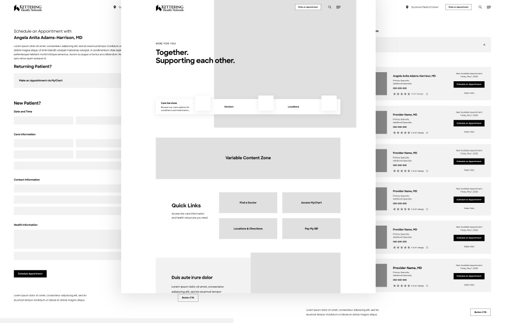
The entire Information Architecture (IA) reflected what the community identified as the most important web interactions. This data-driven framework anchored a simplified navigation, search, task navigation, page hierarchy, calls-to-action (CTA) and user interface (UI) layouts. To further support this on the back end, we structured the content to display contextually relevant and personalized information to help the consumer.
User Experience (UX)
Establishing clear pathways based on user expectations, tasks and objectives is always a guiding light for these strategies. We applied 3 key UX laws to meet those expectations by minimizing choices, carefully sizing and positioning interface elements, and utilizing chunking to ease complex tasks.
Smart Idea
Help guests find and use digital tools by creating well-designed navigation. This includes strategic linking within the site, increased readability of copy and organizing content in a purposeful and methodical way.
Persona Mapping
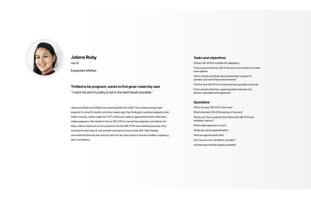
Personas and archetypes are built on data and representative of actual attitudes, goals and thinking. They also serve as a great measure of success. We map each of our persona and archetype journeys across priority pages to ensure creation of helpful, engaging content that answers user questions and converts by supporting the next step. This meaningful interaction builds relationships, creates trust and helps achieve strategic goals.
One “Best” experience
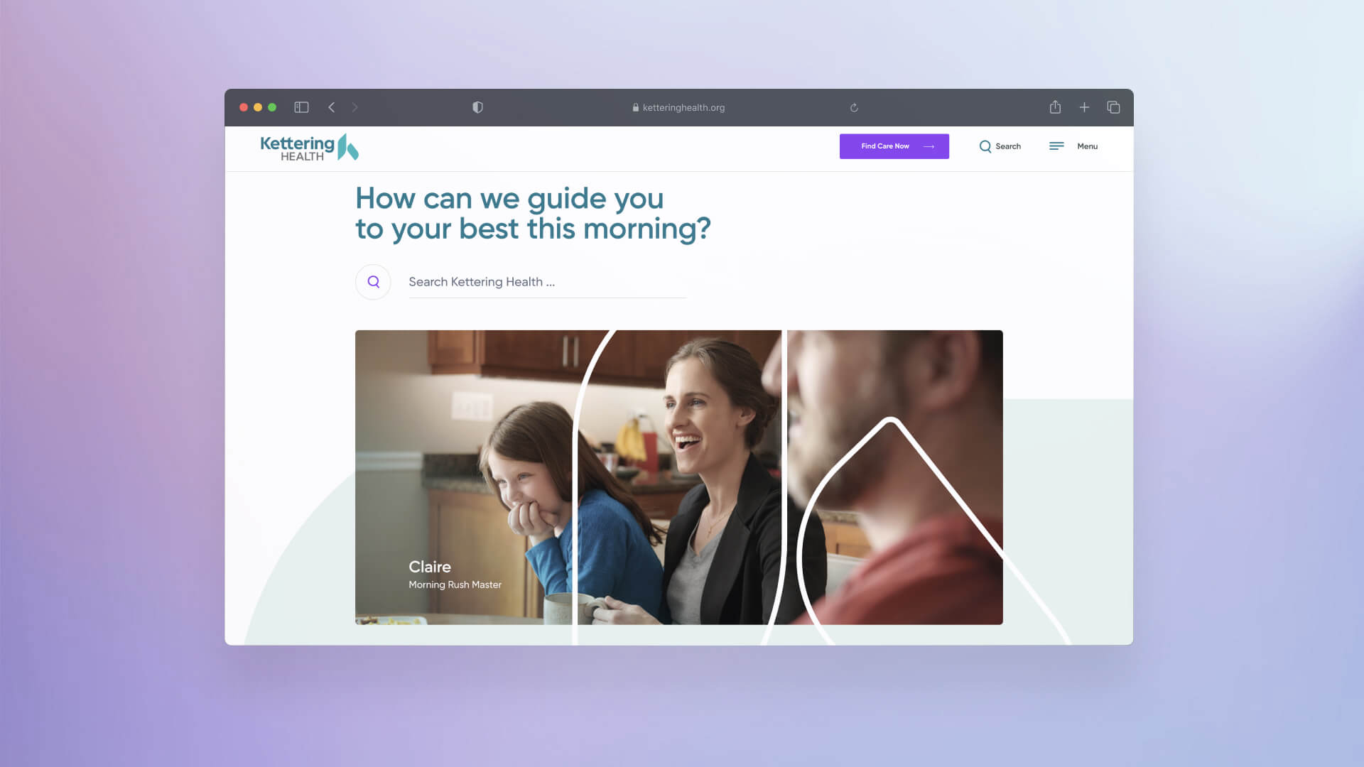
"This is the best-looking hospital website I’ve ever seen. It's really exceptional."
Jimmy Phillips
VP of Marketing & Communications, Kettering Health

The Results
Kettering Health launched one of the most transformational healthcare provider websites in a class of its own.
Within two months, the performance data validated the dramatic shift. Consumers immediately noticed the clean and streamlined look of the home page. They found and used the enhanced “search” option to identify potential providers and locations relevant to their needs. Clear, SEO-rich content spoke to the audience in terms they could understand (and helped keep the site ranked high on search engines).
Moving forward, the centerpiece of the Kettering Health digital transformation is nimble enough to embrace both the small changes that accrue quickly, and the big swings that will disrupt healthcare. We aspire to be constantly transforming, and the new ketteringhealth.org is the pinnacle of doing that efficiently.
300K
Increase in website traffic
124%
Increase in provider profile engagement
235%
Increase in location profile engagement

