Most families are forced to accept the status quo. Zarminali Pediatrics is ready to inspire a new generation to choose better for themselves and their kids.
The moment families feel
Pediatric care feels fragmented. Parents carry the burden of coordination; clinicians feel the strain; outcomes suffer. The next generation is the most advanced in human history, but the way we care for them hasn’t changed in decades. Zarminali (pronounced zar-mee-naah-lee) set out to be the first purpose-built pediatric destination for seamlessly coordinated primary and specialty care. This bold move means meeting real family needs, not just rebranding the status quo.

Need
Create a new, believable category
We weren’t just developing a brand, we were defining a new category and raising expectations. Inspired by the name Zarmina, rooted in the meaning, "something that is more precious to you than gold," Zarminali represents a shared belief of parents everywhere: There is nothing more valuable to you than your child. We all want ‘better’ for our kids … but that is getting harder to deliver. How do you create a space where pediatric care actually feels so good for those receiving or providing care? And, how do you become the courageous leader who carries the weight of navigating the pediatric care experience? The brand story needed tension and consequence to deliver “peace of mind” and “one less thing to worry about” for families.
Answer
Platform first, identity with purpose
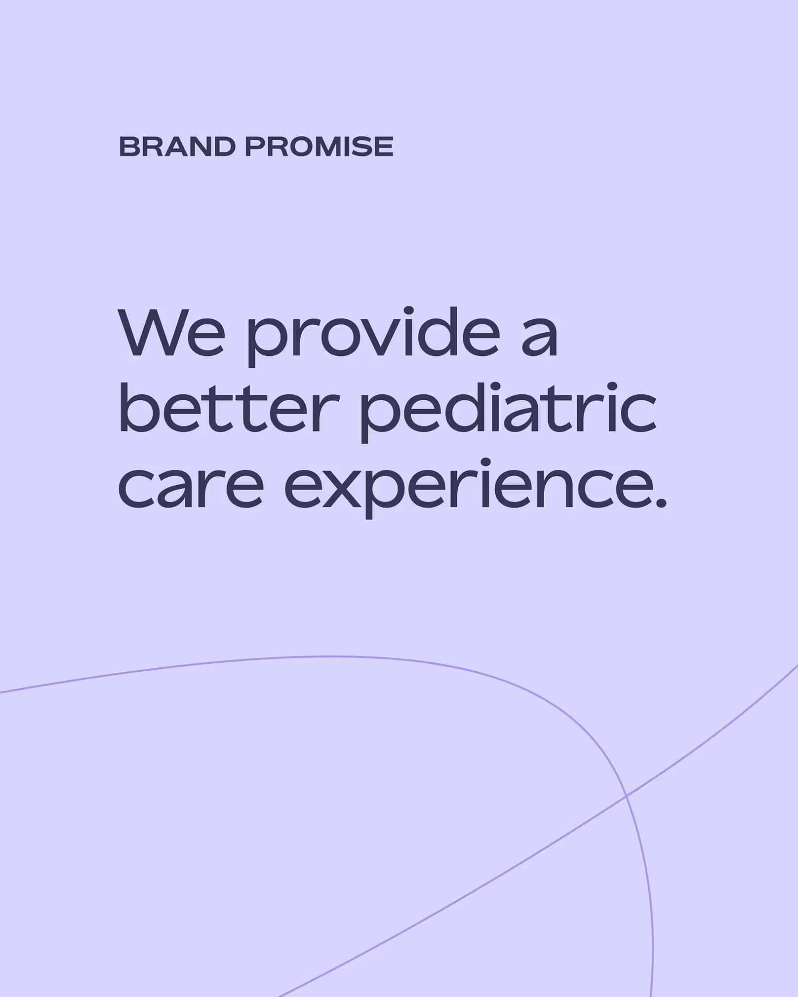
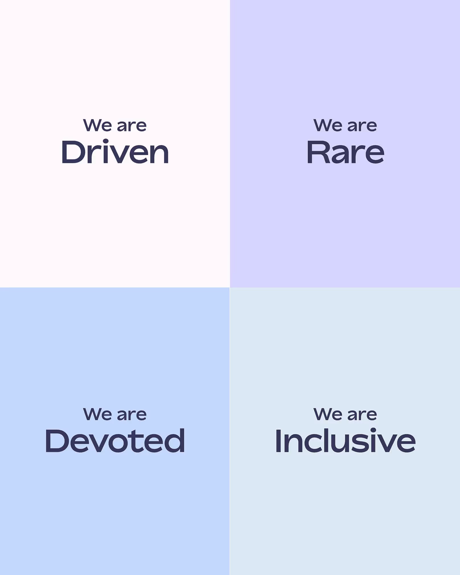
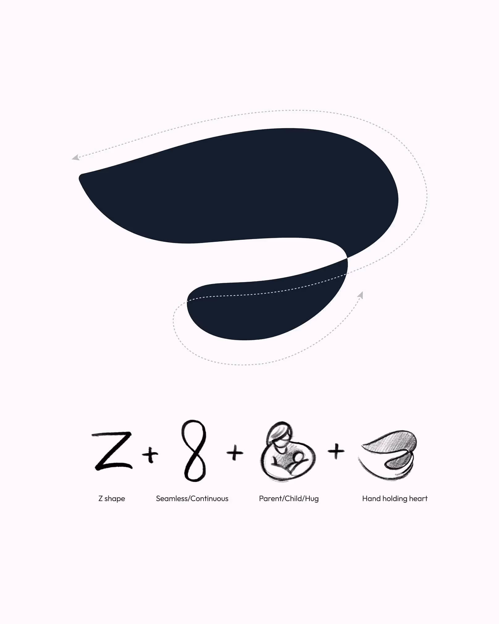
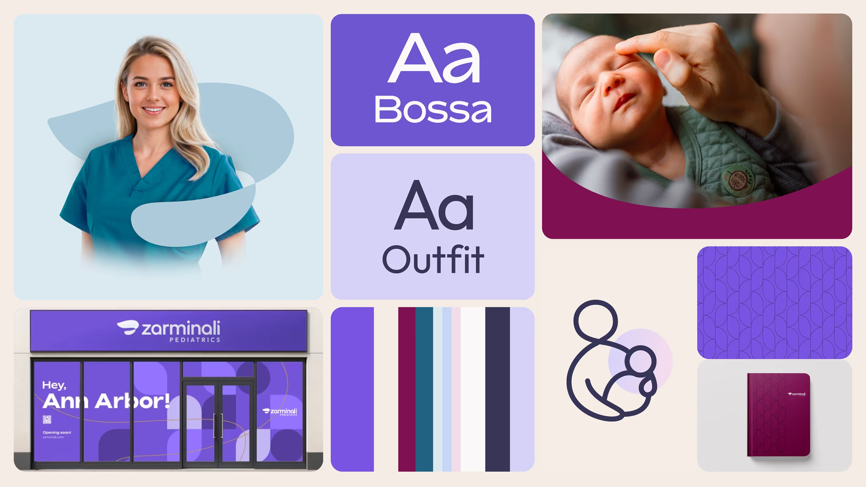
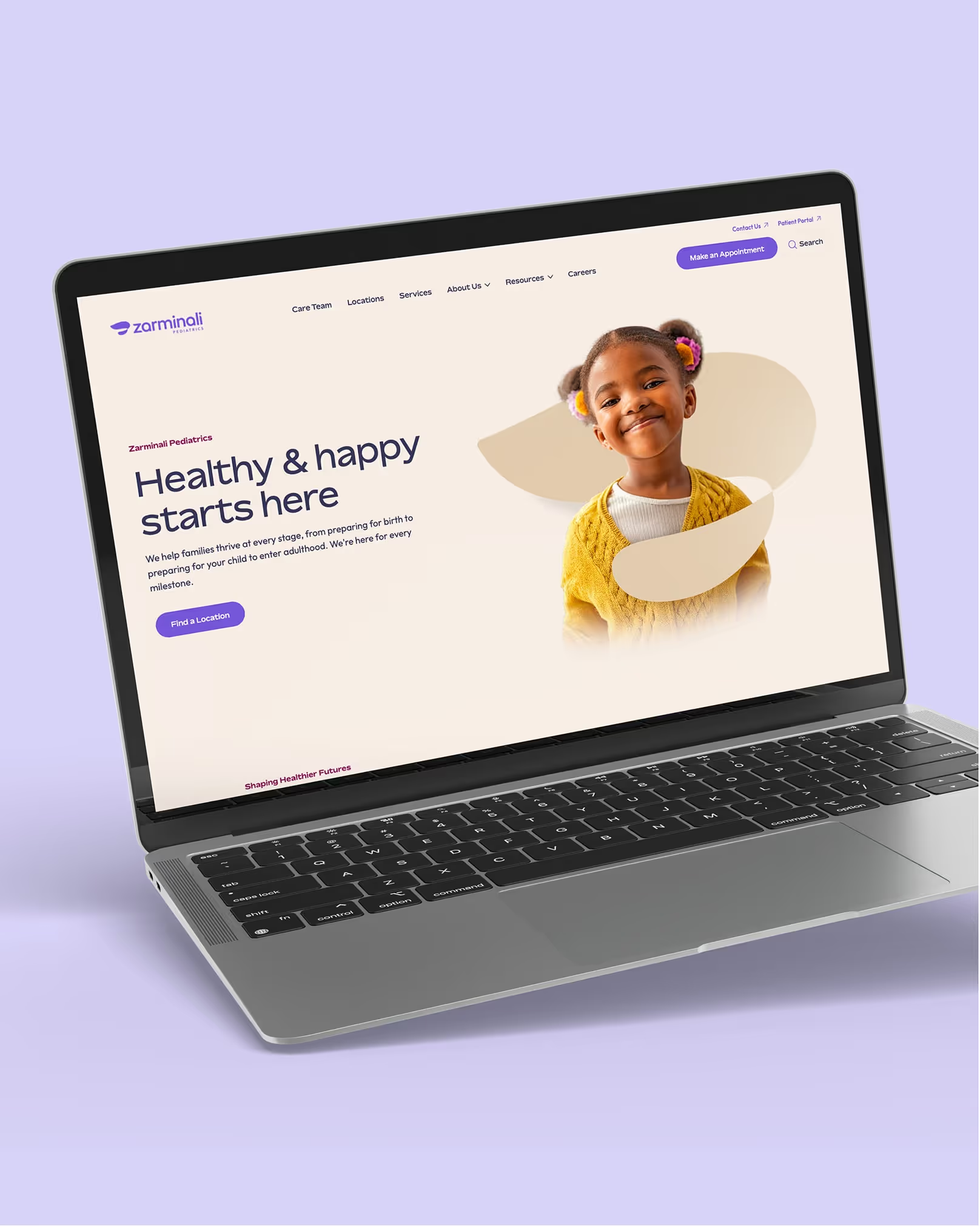
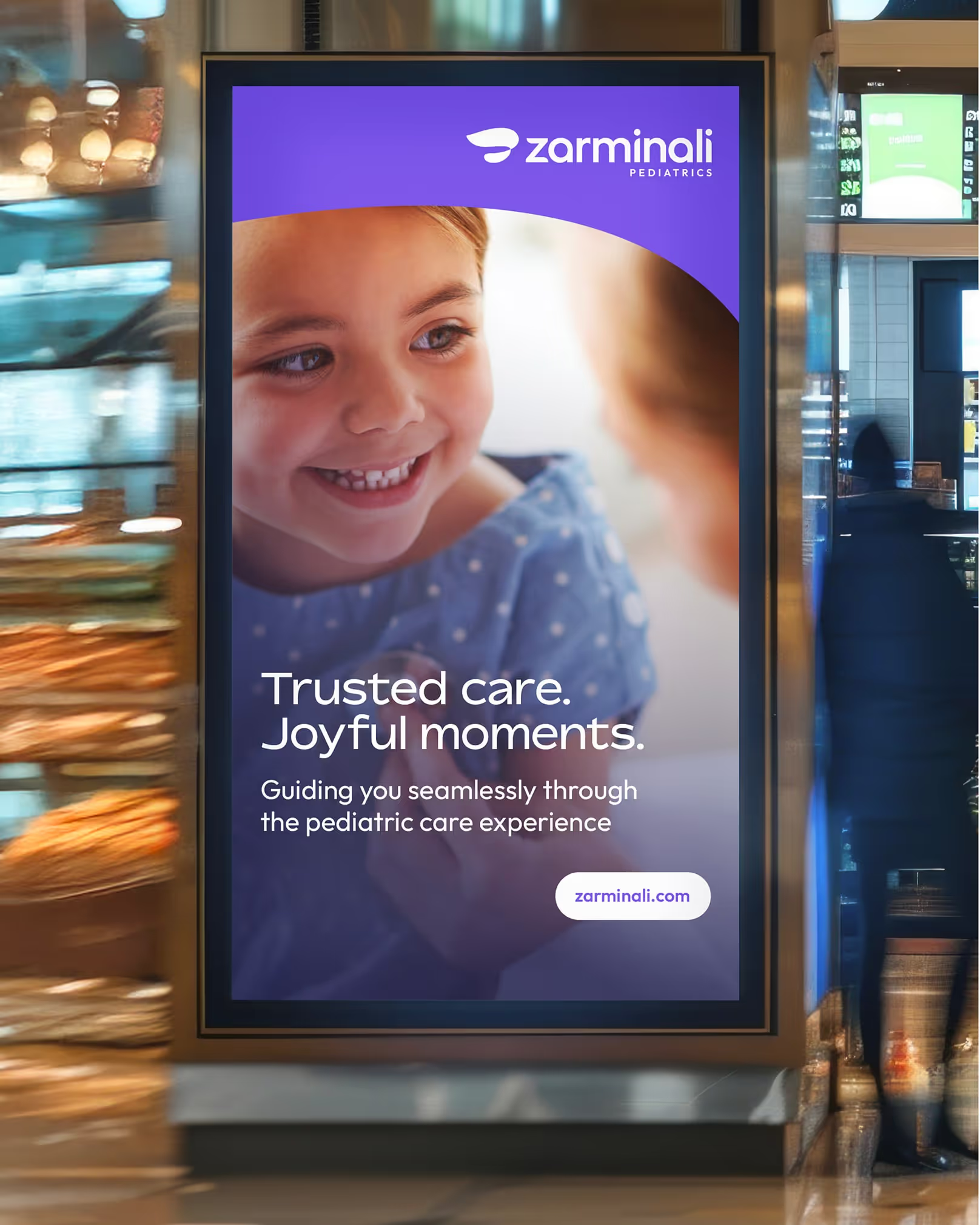
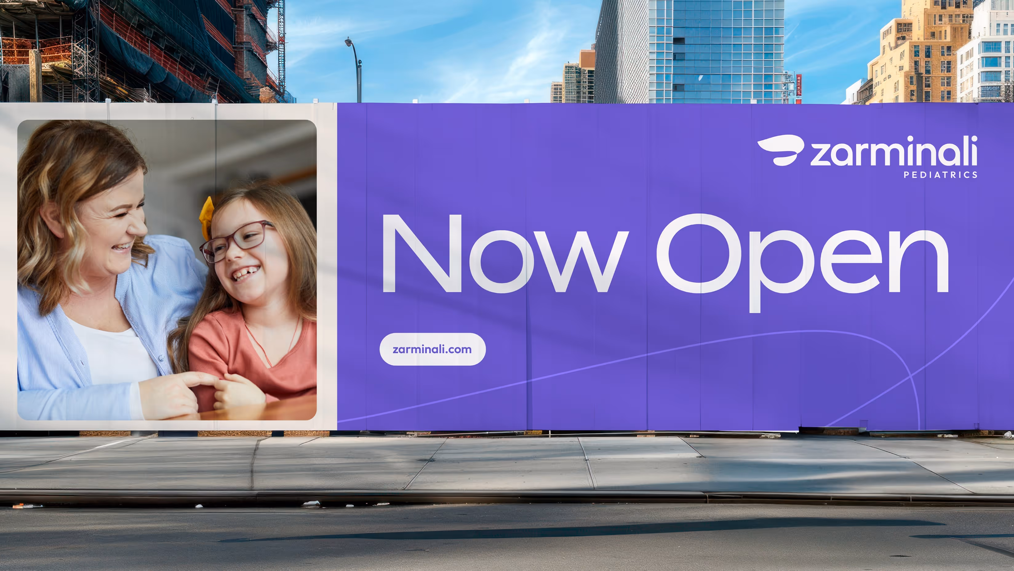
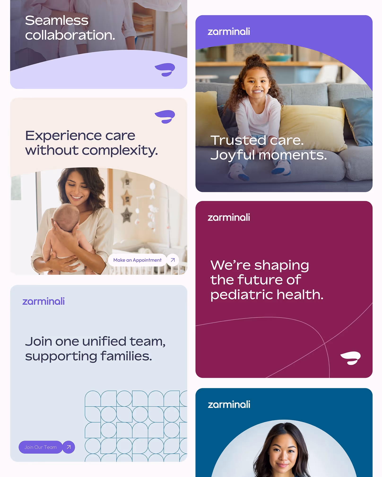
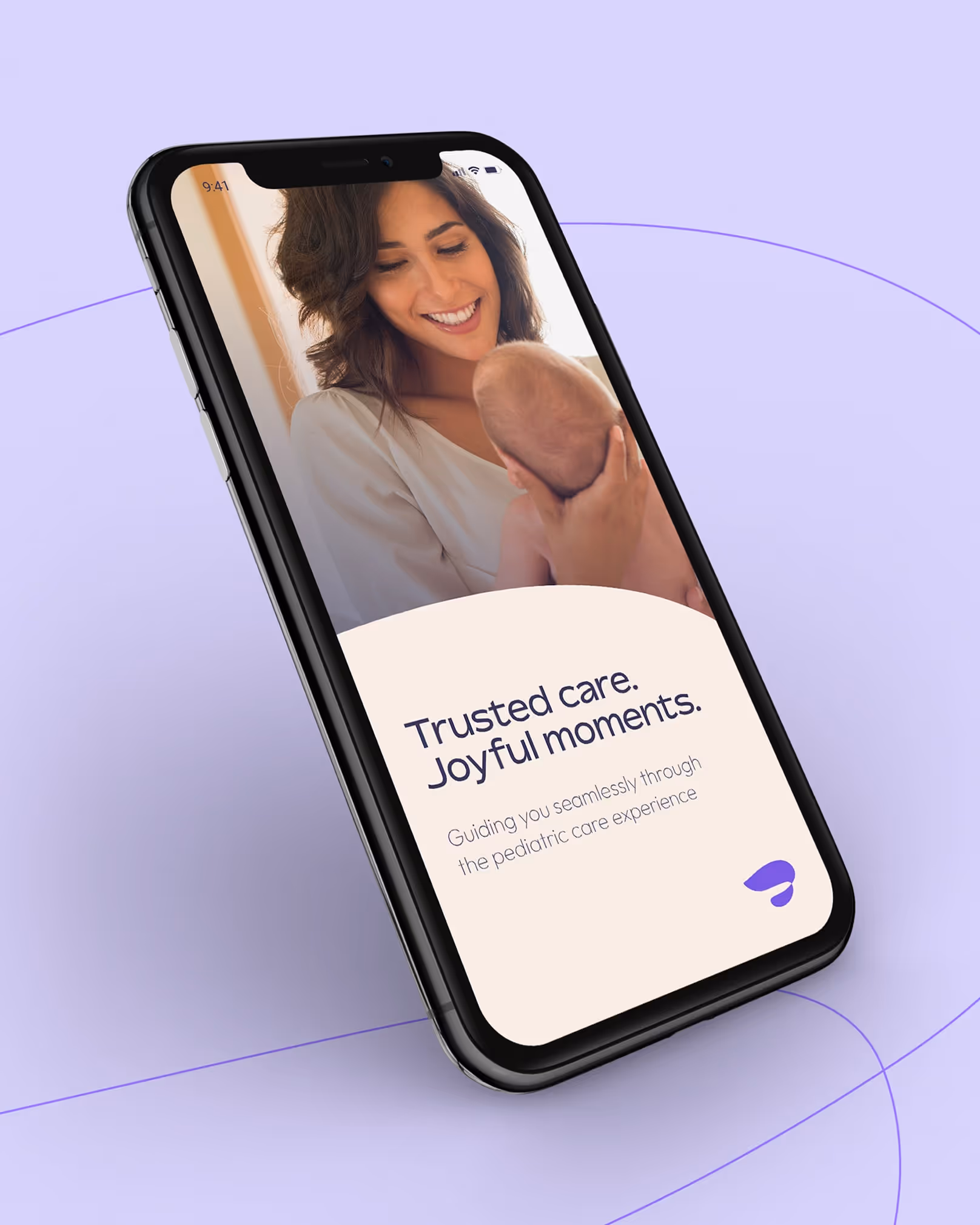
We anchored the brand to a plain-spoken promise, “We provide a better pediatric care experience.” Then we codified a platform and visual system families can trust: identity pillars (Driven, Rare, Devoted, Inclusive) and a logo/icon that signals a nurturing, continuous bond (an organic infinity loop). Palette leads with Empower Purple and Zarminali Plum for recognition and accessible calls to care.

Really fantastic work. It's impressive what you guys have all thought through and come up with, and it feels really good … a great first step to launch to the world.
What if pediatric care felt beautifully simple, from first glance to first visit?
We went there. We translated the category story into brand signals people feel: a distinct icon with forward momentum and comfort; a warm, modern palette; and clear messaging architecture that elevates coordinated care over point solutions.
Proof
What changed and why it matters
A category-level story and identity families can recognize, use, and trust.
- Brand Promise: “We provide a better pediatric care experience.” Embedded in guidelines for consistent use both internally and externally.
- Identity Pillars operationalized: Driven (tech + integrated model), Rare (seamless confidence), Devoted (family partnership), Inclusive (welcoming, collaborative).
- Distinct visual identity system: Organic infinity loop symbolizing the parent-child bond, designed as a “vessel” for imagery and moments.
- Recognizable palette for action: Empower Purple and Zarminali Plum guide emphasis, links, and CTAs while maintaining warmth and accessibility.
- Narrative clarity: Bold story deck that is refreshingly intentional to show up and deliver on the experience that families deserve.