When your name already carries the region, brand work must move hearts and market share. Willis Knighton Health needed a platform and identity that honored 100 years, and equipped the next 100.
A century-strong brand at an inflection point
Willis Knighton entered its centennial as the community’s default choice, and a competitive bullseye. Competitive expansion and new alignments threatened consumer loyalty. The moment meant crystalizing why WK leads and showing how they are built to lead what is next.

Need
Protect leadership by unifying promise, identity, and proof
We had to convert legacy trust into a sharper, system-wide story: a clear platform, an identity evolution beyond “Health System,” and a campaign arc that balances a nod to the past with looking ahead. The team at Willis Knighton has worked very hard, but recognized the need to create space to elevate service lines as category leaders.
Answer
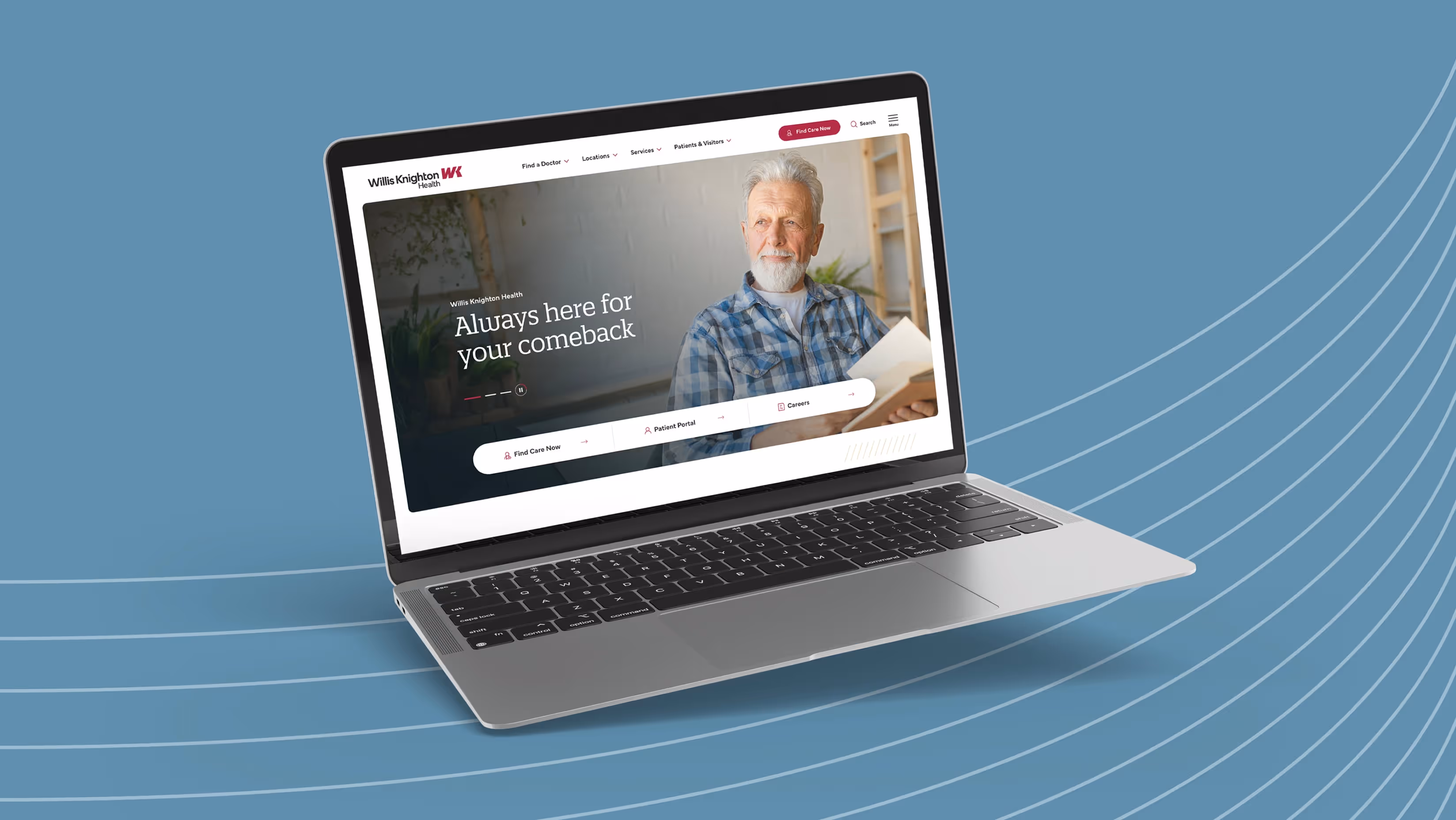
Brand platform first, identity evolution next
We anchored the brand in a concise platform and brought it to life through a modern identity and planned rollout.
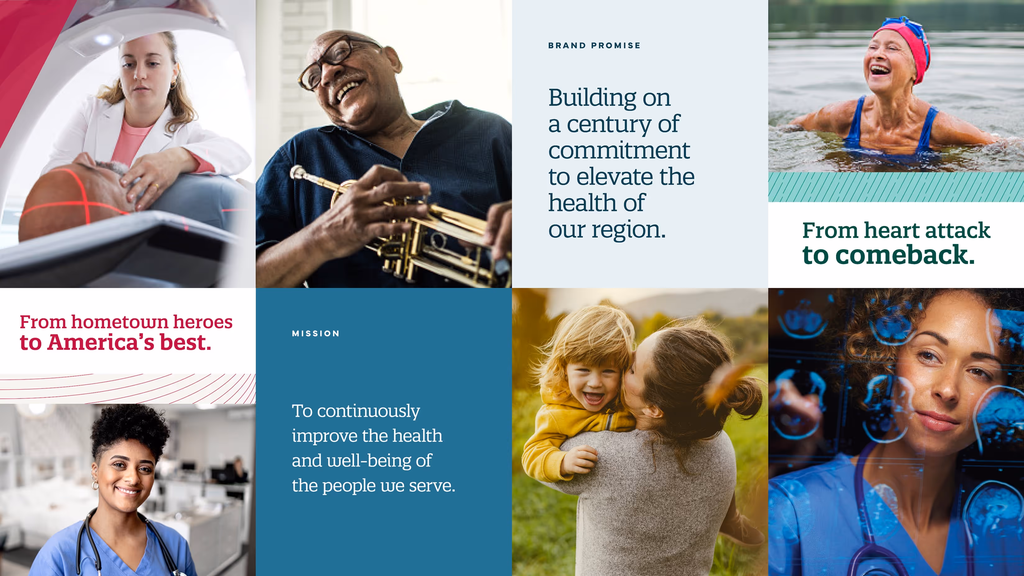
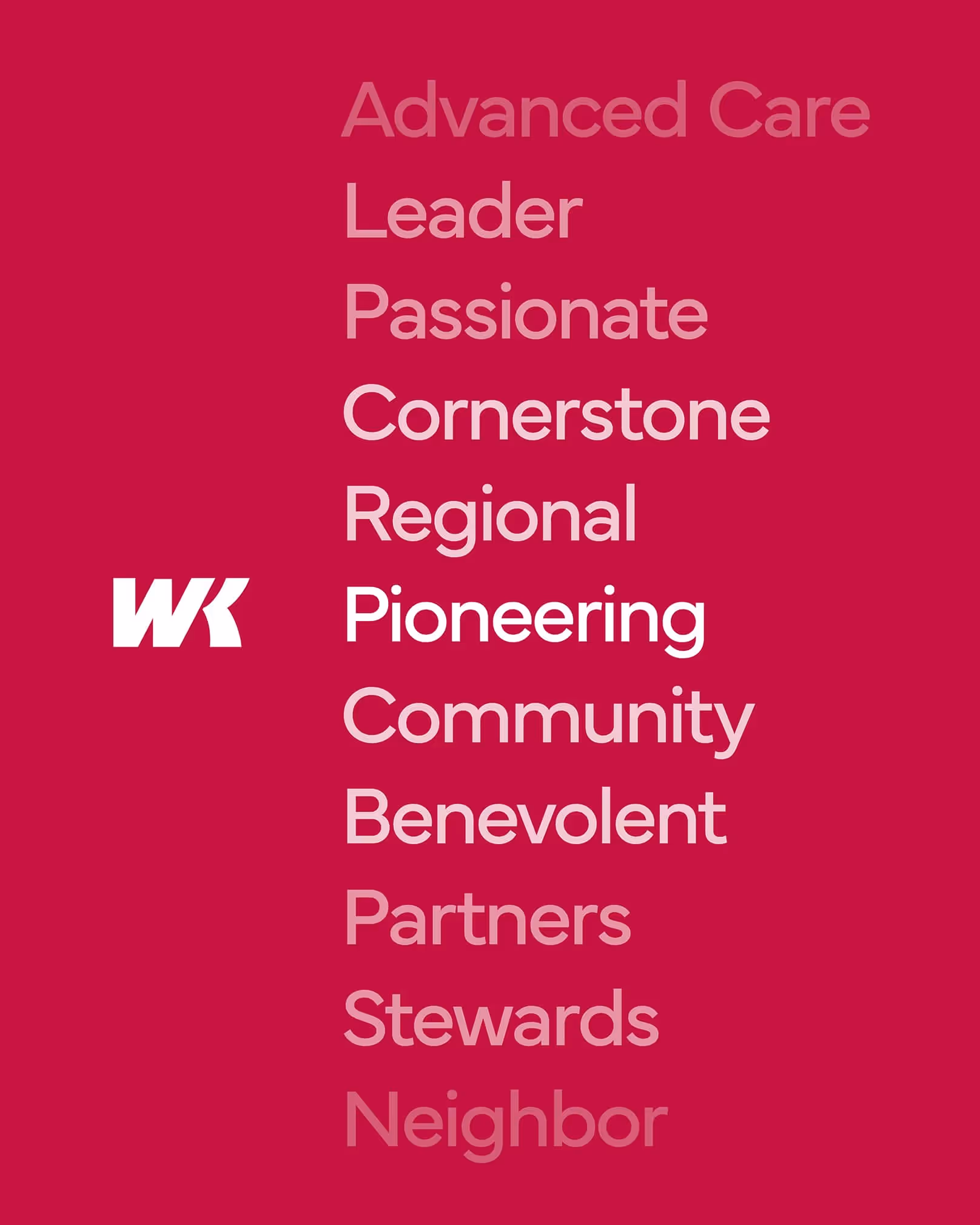
- Platform. Positioning WK as the regional healthcare leader and cornerstone of the community, a pioneering brand essence and a core promise to keep: “Building on a century of commitment to elevate the health of our region.” Go-to-market pillars: Advanced Technology, Comprehensive Services, Commitment to Excellence, Patient-Focused, Community Partner.
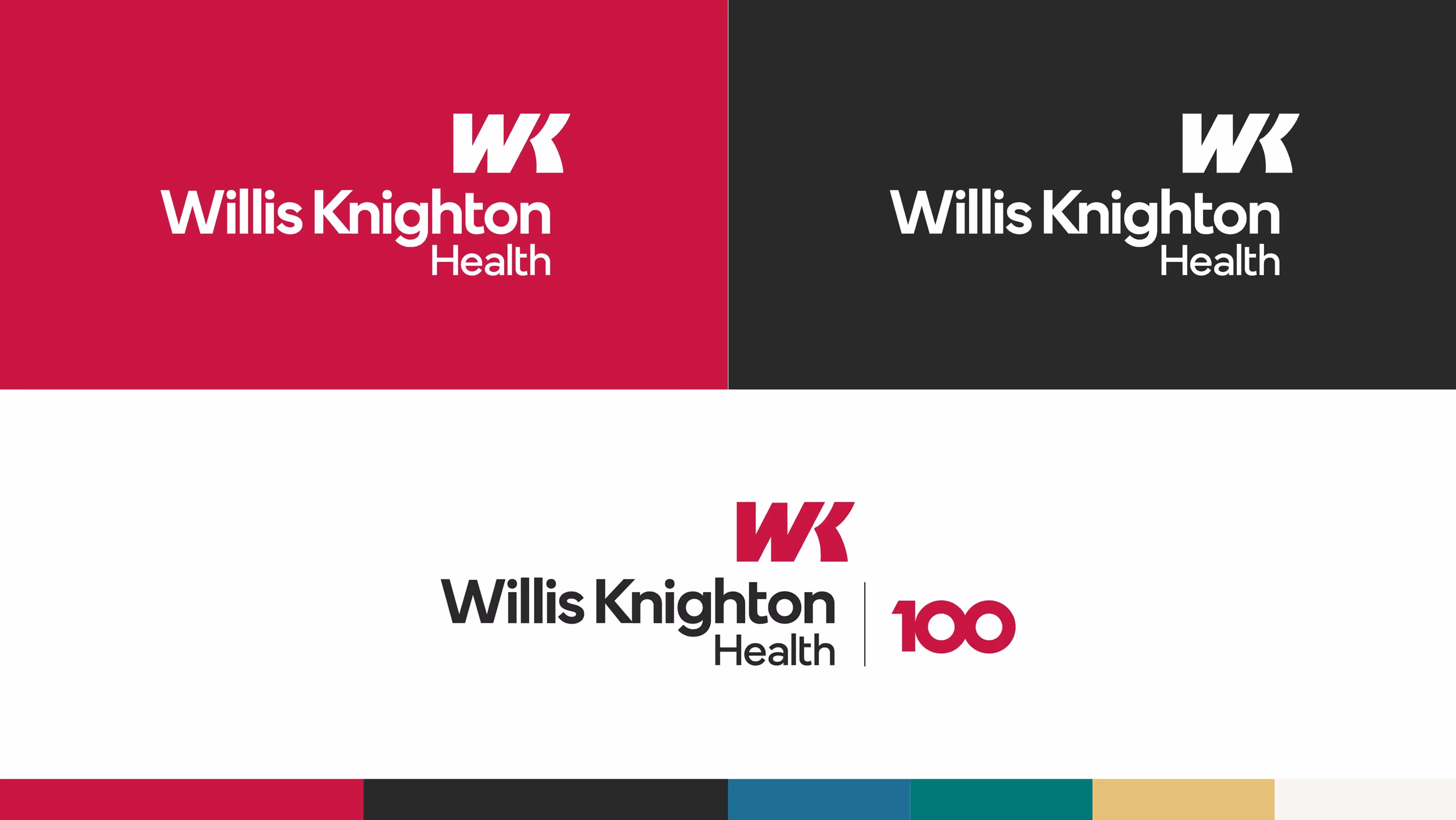
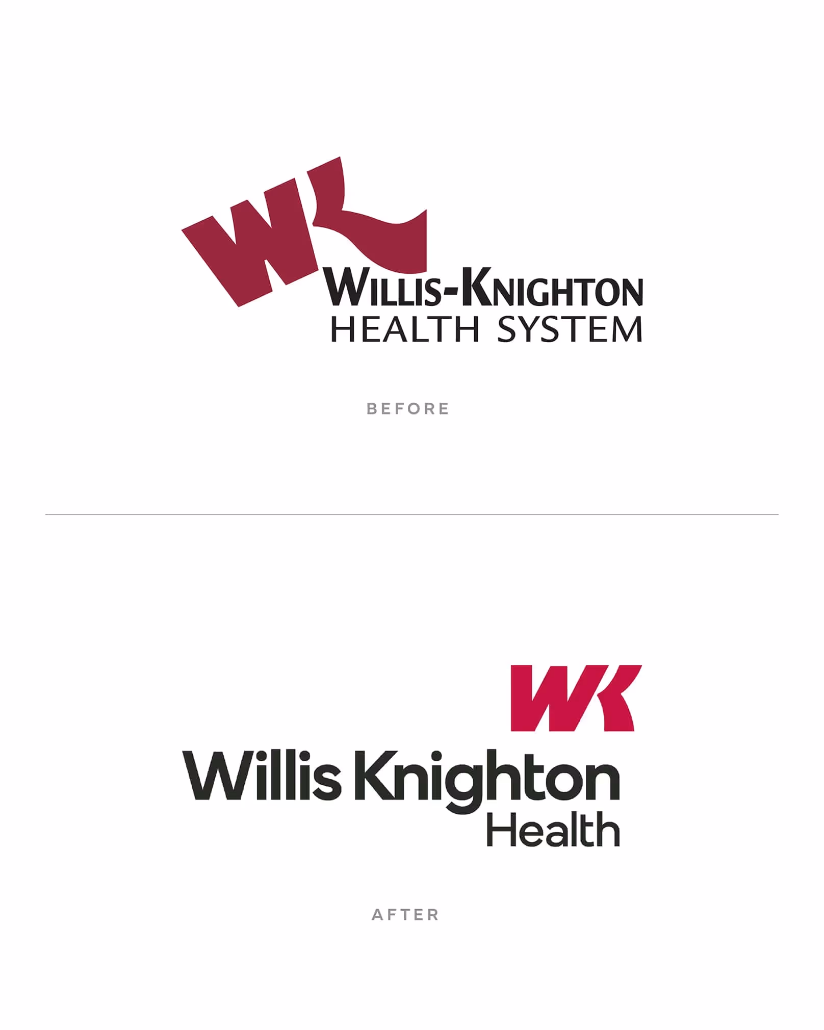
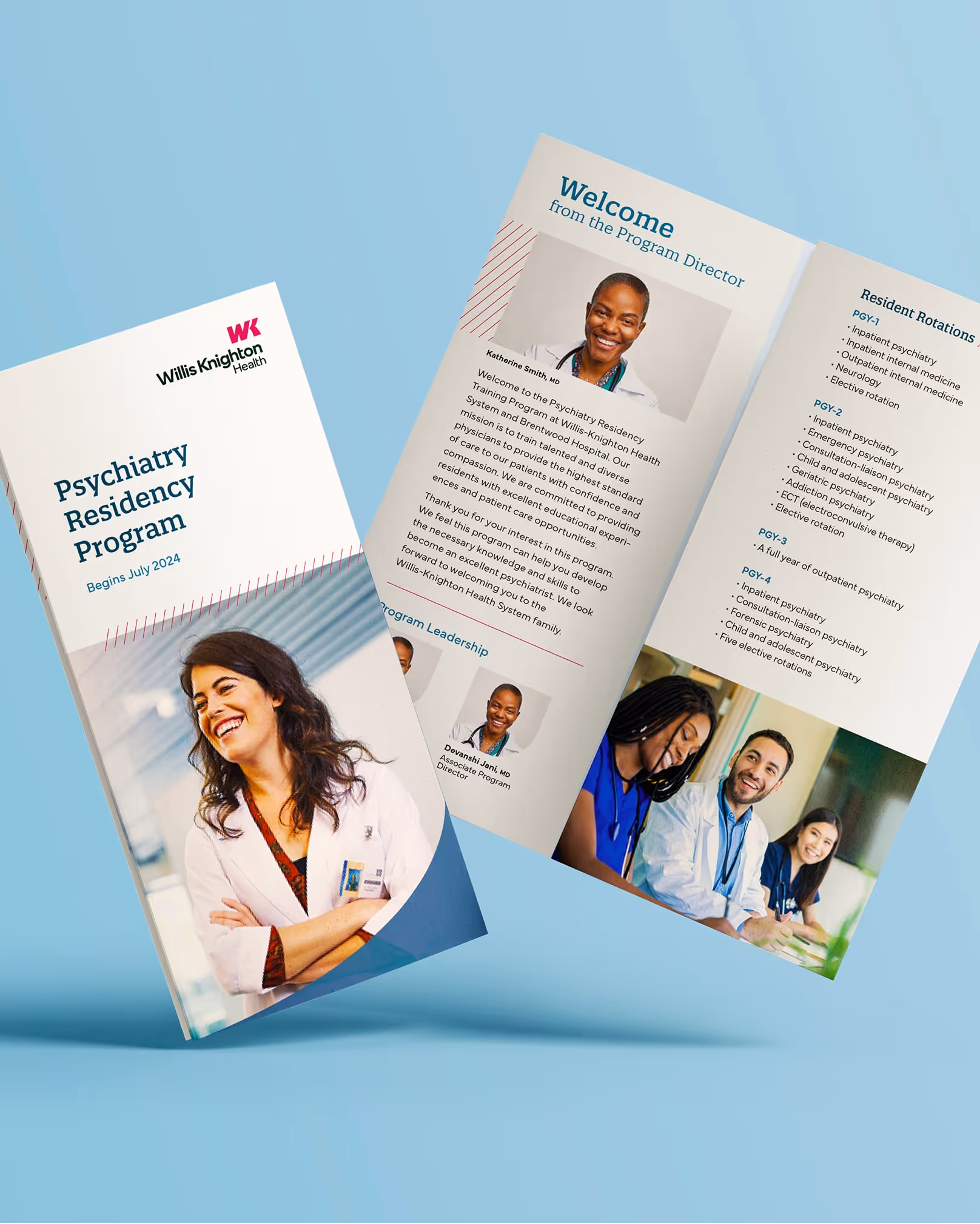
- Identity. Shift from Willis-Knighton Health System to Willis Knighton Health, with a refreshed logo that can signal breadth beyond brick-and-mortar and avoiding “outdated” cues. A pragmatic 3–5 year plan to make demonstrable differences.
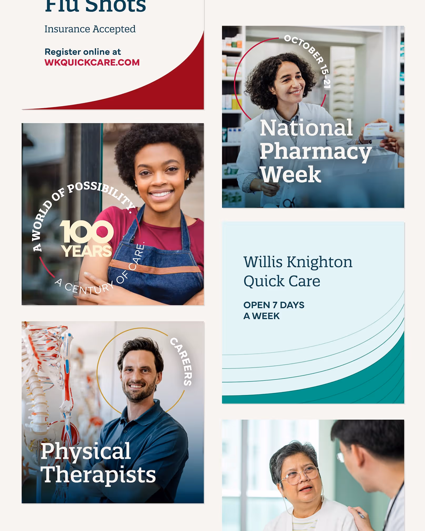
- Campaign arc. A 12–18-month journey from centennial launch to “a world of good”, enabling service-line proof (Cancer, Women’s, Ortho, Heart, Physician Network) and stage-based measurement across the funnel. Early feedback and testing showed the intentional refresh was well received by employees and the community.
- Audience lens. Creative and channel choices reflect the DMA’s core population, grounding the brand in real community voice.
Ten Adams provided outstanding support for our rebranding and 100th anniversary, helping us to reflect on our past and position us for the future.
Marilyn Joiner
Director of Marketing & Communications
Willis Knighton Health
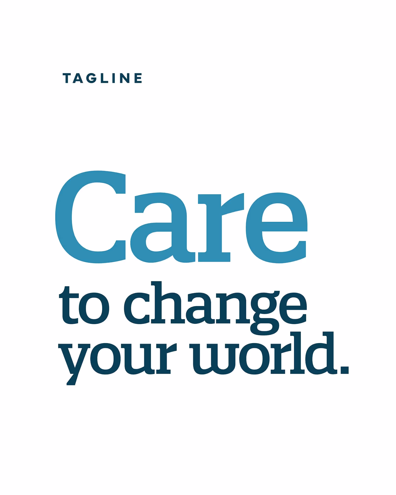
What if a century of trust could propel a world of good, every day?
We made the brand the hero, then attached simple, service-line proof to it, so every touchpoint signals progress people can feel.
Proof
Leadership clarified, momentum organized
- Market leadership, quantified. BPI 42.8 (WK) vs <36.4 among local competition. Top-of-mind recall 53.6%; preference 46.9%; easiest-to-reach 55.6%. The platform and identity codify why.
- Name & logo evolution with rationale. Dropping “System” broadens meaning; change combats “outdated” cues; 3–5 year rollout optimizes downstream activation spend.
- Campaign continuity. Defined path from centennial to “a world of good.” KPIs and service-line storytelling keep the brand present and progressing.
- Community fit. Audience-first planning reflects local composition and values; the refresh drew strong internal/community reception.